

It’s been a while since you’ve heard from us here, so let’s change that! By ‘us’ I mean the user experience design team at SDL; a small group of design thinkers, prototype tinkerers and interface artists. Rest assured, we haven’t been lazy or out surfing. We’ve been working hard on a variety of exciting projects and products.
One of the projects we’re really excited about is a new user experience design for SDL Tridion Sites. It’s still early in the process, but far enough to get our community to validate and provide feedback. And that’s where you come in! :-)
I’m sure you’ve seen the recent announcement around SDL Tridion DX, which harmonizes SDL Tridion Sites (former SDL Web) and SDL Tridion Docs (former SDL Knowledge Center) into one suite. If not, check it out here! We think this is excellent news as it allows us to rethink and redesign how these products work, look and feel. So, how do we start?
Content is Content
We know that each product serves different user communities: marketing departments for Tridion Sites, and product and support teams for Tridion Docs. Both of these communities often work on content that eventually ends up on the same web pages, whether that’s a marketing campaign, an interactive product configurator, a shopping experience, or a support article.
Through our ongoing research, we have made a lot of friends in both communities, and recognize that in many organizations these content teams are still quite separate. But we also see that organizations can no longer afford to operate in silos. Today’s rich and engaging customer experiences require efficient and integrated solutions in which collaboration and transparency are key.
Scenarios involving content mashups and content API use require many moving parts to coordinate and (inter-)operate. Content needs to move through a content lifecycle process in an efficient and directed manner. We think we can support that very effectively by aligning and evolving the user experience and user interfaces of both products, Tridion Sites and Tridion Docs.
Our Direction
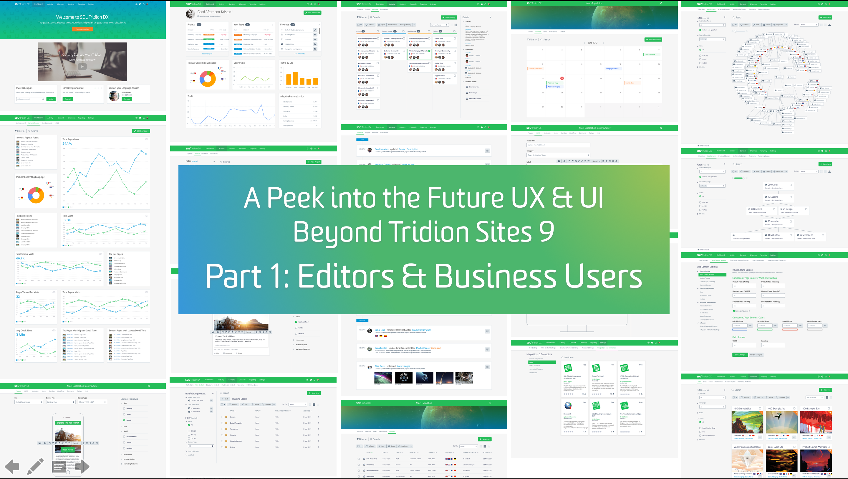
I would like to share the results of the first iteration of this design process in this and the next post, providing the broad strokes of our experience design direction, including many concrete and visual examples to make it as tangible as possible. Consider it a minimum viable concept design which we build to learn. So please stick with me, even though it’s a bit of a long read, and provide your feedback in form of a comment below!
Graphene Design Language – A New UX & UI Paradigm
SDL’s user experience design team works across all SDL projects. We are a small but well-connected community, so we exchange our work and learn from each other, even though we serve entirely different markets and domains.
The new Tridion DX interface paradigm originated in a different domain, for different user needs and requirements. In the last few years, we launched a variety of services for professional translators with our Language Cloud offerings. The challenge was to design new user experiences for individuals and small teams who would review and assess our offerings on a public website, comparing us against other online services.
This meant that all of the flows and interactions needed to be engaging, relevant, valuable, and most of all, self-service. While subscription plans and trials make it easy to win subscribers, they are just as easily lost if they don’t see value or dislike the user experience. The marketing messages, visual content, sign-up and onboarding all had to be simple, intuitive, modern and appealing.
This context informed a new user interface design language, which we later called the Graphene UI. This is the result:
Our previous product UIs followed the ‘Carbon’ metaphor: a strong material for highly specialized applications in enormously complex and demanding circumstances. This metaphor reflected our enterprise customers’ day-to-day reality, so this was a good UI metaphor at the time.
The Graphene UI also follows this ‘UI materials’ metaphor. Graphene as a real material is considered the material of the future: truly two-dimensional, 207 times stronger than steel and bendable. It conducts heat and electricity efficiently and is nearly transparent… think what you can build with that!
Graphene is the perfect metaphor to describe our ambition to create a new class of user interfaces at SDL.

This new UI design language should be state of the art in terms of aesthetics and visual design, it should firmly carry the SDL brand, it should be robust and strong enough to carry the weight of highly complex enterprise implementations, and it should be flexible enough to adjust and adapt to the variety of digital channels, contexts and devices our customers use today and tomorrow.

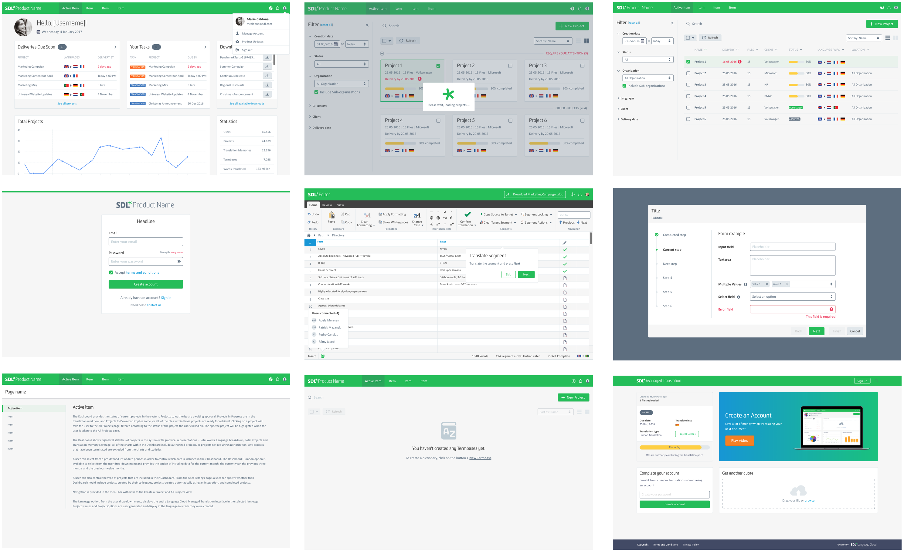
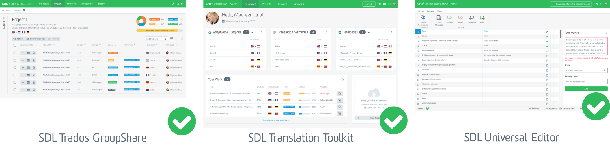
Our journey towards this new design language started with Translation and Localization Management products, including SDL Trados GroupShare and the SDL Language Cloud Translation Toolkit, which have already been released with a new Graphene UI. Others are currently being worked on.
From these products, we learn and actively collect feedback to further inform the development and evolution of the Graphene UI. Now we have started translating the Graphene UI to Tridion DX, starting with Tridion Sites. It’s a balancing act, maintaining the level of simplicity and usability that inherent to the promise of Graphene, without compromising the flexibility and extensibility of the Tridion Sites product.
But what would a design challenge be without a good set of constraints, right? [;)]
Graphene UI for SDL Tridion DX
We started the discussion on how to design and build this new user interface across the various Tridion Sites design, development and architecture teams. From a UX design perspective we assume a full responsive user interface, that seamlessly scales to a variety of different devices and form factors.
While we are not yet taking a “mobile first” approach, as this does not represent the context and the preferences of the majority of our user base, we will ensure that all screens are fully designed for touch interactions and gracefully scale to mobile.
The below screen gives an idea how a typical Tridion Sites “list screen” translates to the new Graphene UI. It’s simple and clean, gently exposing our new corporate brand identity, with much more white space and a clear focus on relevant and applicable information and controls.

However, we know that changing the look of the UI, and making it responsive and touch friendly, does not radically alter the overall user experience.
The Tridion UI was built on the hierarchical content structure that sits at its core. For implementers or admin users who know their way around the setup, this poses no difficulty and makes this structure quite intuitive. However, for business users such as content owners, copywriter and web designers, this poses an unnecessary level of complexity, distracting them from their main focus and passion: the content itself.
Improving the user experience for these users can be achieved by abstracting the complexity that comes with each implementation to a business process level. These business processes revolve around content lifecycle management and deserve a prominent spot in the user interface and overall information architecture.
Setting Up a Task-based Information Architecture
Taking into account the Tridion information architecture and the need to make the experience and task flows more intuitive led us to these questions:
- How do companies and teams typically manage and operate their content management systems and processes?
- Is there a default operating model?
- And if so, can we change the UI to better support and guide such a model?
Of course, every company is a little different, works in a different way, and has different goals and objectives, so we had to generalize and idealize. We applied the Jobs To Be Done (JTBD) framework as a tool to map the individual “jobs” every company needs to get done and for which it would “hire” products.

Content Lifecycle
We followed a typical content lifecycle process and clustered jobs into main categories, drawing an idealized flow from planning through to archiving and retiring content.
This categorization and flow is more aligned with a business user’s mental model of Tridion Sites. We used it as the basis for the overall information architecture and navigation setup. We are also very conscious of the needs and requirements of our technical user base as well, since both users need to find their way through the UI quickly and effectively.
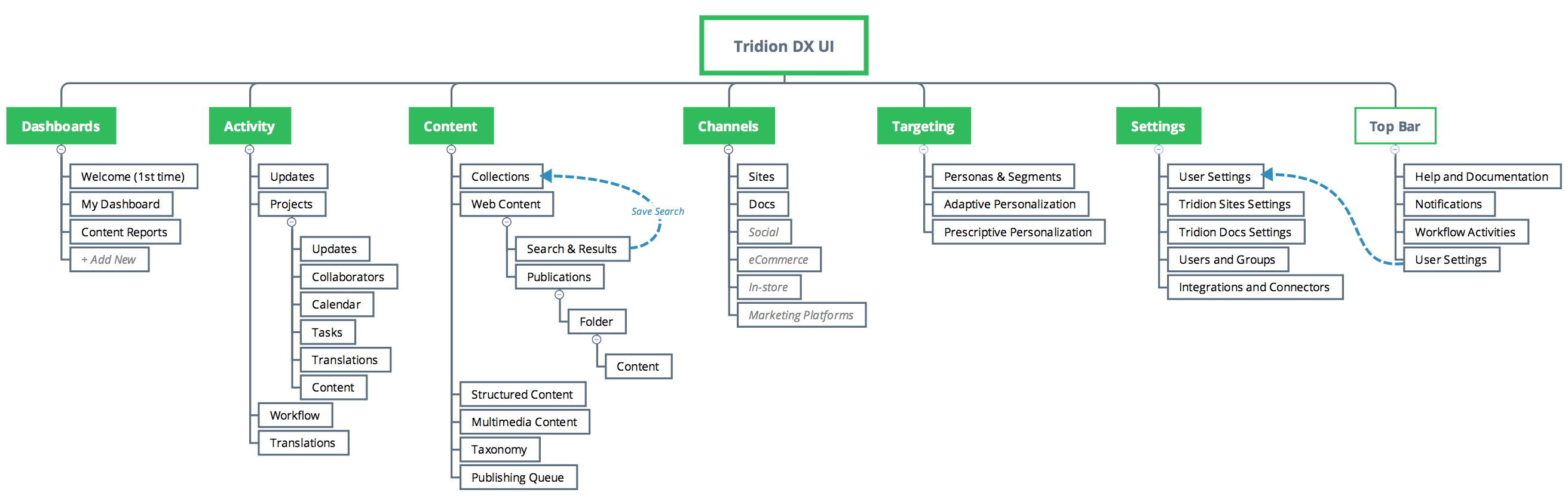
Roles and Personas
We chose the main navigation sections to correlate with the roles and job profiles within our customers’ organizations. This will allow for hiding or deemphasizing navigation options for different groups of personas to ensure individual users will see and use options relevant and necessary for their workflow, allowing for more focus and providing implicit guidance for the task at hand.
In addition to the structural change, we changed the visual representation of the main and sub navigation to be visible at the top of the screen and not hidden away in a slide-in menu.

The Onboarding Experience
When you enter your office or home you would like to be welcomed and feel comfortable. Why should this be any different when you enter a web content management system? We took this analogy to work on the Tridion Sites first touch and onboarding experience.
Like the lobby of an office building, a first time a user will be greeted on a welcome screen, like in the lobby of an office building. After logging in for the first time, the users is provided with all the information needed and wanted, such as a general or personalized video, step-by-step guides, quick access to learning material and documentation, prompts for required setup activities.
Of course, this also includes the ability to adjust and change the login experience to the individual needs of a user as she grows into and expert and more experienced user. The idea is that the UI grows with the individual user, becoming more sophisticated as the user requires more expert functionality.
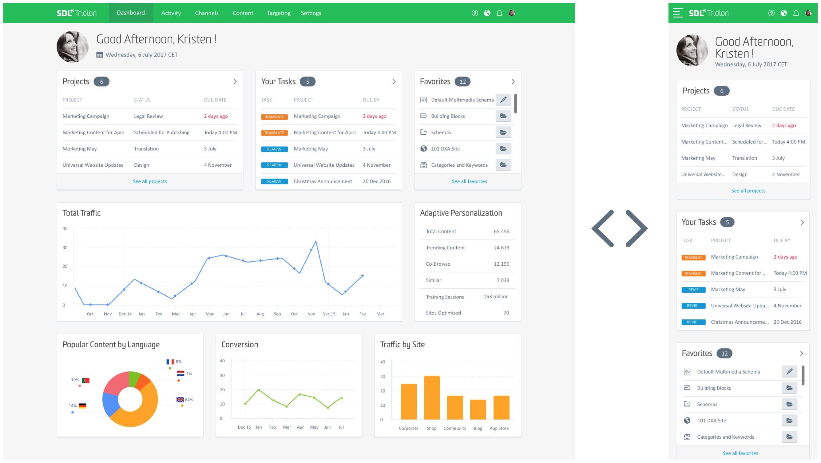
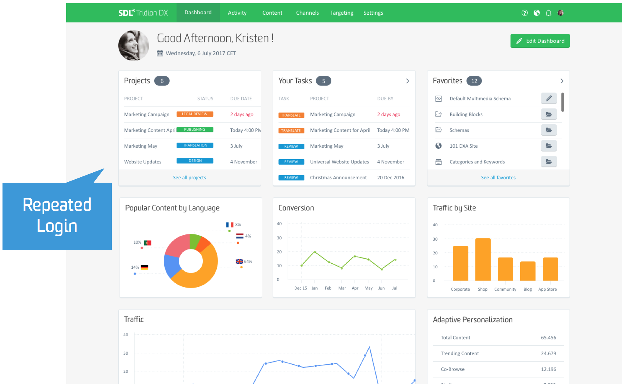
The example below shows this behavior of the user dashboard which transforms from a general welcome screen to a more personalized and advanced dashboard.
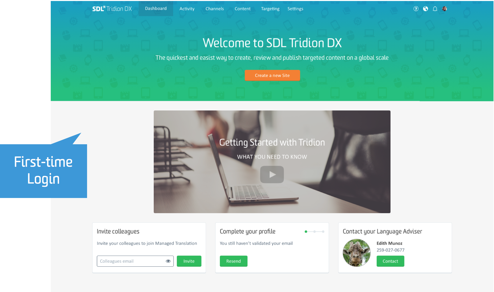
Please consider the startup screen as an example. We want to improve the out-of-the-box character of Tridion Sites altogether. The goal is to provide a standard setup that comes with good defaults so that customers can use it from the start and do not necessarily require extensive configuration.
Dashboards
The "Dashboard" section is the “home” of the main navigation and where you would enter Tridion Sites. Dashboards will provide a powerful and flexible way to quickly access data and any kind of information in a short, visual, summarized format.
We also expect dashboards and their information to become the key screens that users will consume most when using mobile devices ‘on the go’. For this interaction, we will continue to follow the “better out-of-the-box experience” principle, providing a handful of relevant preconfigured dashboards, including the “cards” and connectors that come with them.
This individual user dashboard will provide a personalized view on tasks, notifications, shortcuts and key metrics. The data and cards on this dashboard will vary depending on the user’s role, behavior and preferences.
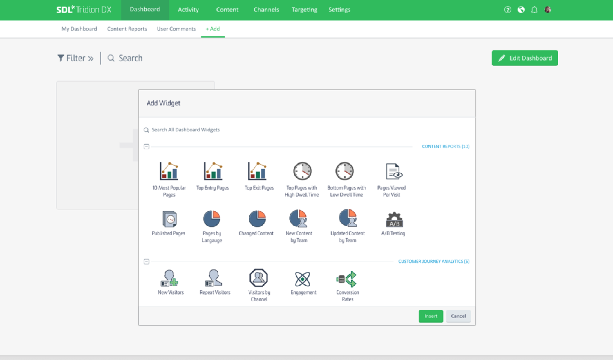
A content reports dashboard could also come out of the box, providing a variety of information and metrics directly related to content stored in and managed by Tridion Sites. This type of dashboard would not be personalized but would show system and content metrics. In addition to the mobile device ‘quick peek’ example, use cases for this type of dashboard include kiosks and large screen displays in physical team spaces, as a live view on what’s happening in Tridion Sites.
Our main strategy for the dashboards relies on the experience, competence and creativity of our developer community and implementation partners, who are closest to the needs and characteristics of any specific customer implementation.
These professionals have a deep understanding of the type of data and information which should be represented as dashboards. So be assured that your support, guidance and documentation towards developing and connecting new cards, connectors, whole dashboards and more will be as essential as developing the dashboard mechanism that will come with the product.
Team Collaboration in the Content Lifecycle
When analyzing and categorizing the jobs related to content lifecycle management, we see that in reality many organizations use a small core of Tridion teams that run multilingual websites, globally distributed and working on multiple projects at the same time.
Most organizations run a form of agile, meaning processes keep changing and evolving, so static or inflexible workflow models won’t work or help. This is where the previously mentioned abstraction layer around business processes will enable a much larger marketing audience to run and contribute to content lifecycle projects while at the same time managing the underlying content in Tridion Sites.
Updates
This layer will manifest in a new navigation section called “Activity”, dedicated to everything around tracking tasks and getting work done. It comes with “Updates” which provides a simple and personalized overview what happened in Tridion Sites since the last login. The stream would allow for filtering updates for a specific project, product, publication, country, language, team, event, workflow status… you get the idea.
Projects
Although the actual business processes our customers deploy and run are all different and unique, they all contain the concept of “projects” in one way or another.
A Tridion Sites project could have its own updates stream, a list of collaborators, deadlines and milestones (e.g. for content review, translation, publish and unpublish content, etc.), tasks and assignees, translation jobs, and related content or placeholders, which has to be created and published.
Providing project managers with the ability to create and manage web projects, assignments, deadlines, milestones, teams, tasks and placeholder content at a publication or folder level will allow team members to focus on content creation, review, optimization and publishing tasks. It will alleviate the need to be concerned with the actual BluePrint structure, which can be overwhelming and sometimes unnecessary for an inexperienced user.
Workflow & Translations
Besides “Updates” and “Projects”, you will also find “Workflow” and “Translations” in the “Activity” section. Workflow provides familiar access to all workflow activities on your or your team’s name. They are listed independent to the project they belong to. This will allow users to track tasks across multiple projects that run in parallel.
The new Graphene UI aims to provide this information and representation in an integrated and in-context way. We aim to avoid pop-up windows as much as possible to account for seamless mobile and tablet experiences. Lists of items, for example, will include several different “views”, allowing items (content, tasks, projects, etc.) to be represented in all kind of formats and visualizations (besides typical grids and lists).
For workflow and translation jobs we are exploring a “Kanban View” so you can represent your team’s tasks on a typical Kanban board and use it in your daily team standups. For “projects” which also have a time dimension, we are exploring editorial calendar views and Gantt chart representations for project planning and resource allocation.
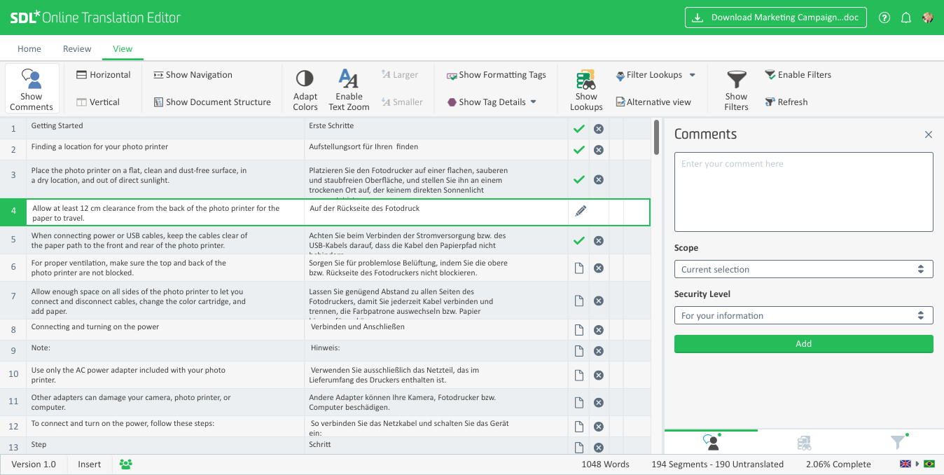
In-house linguist reviews of returning translation jobs will also become a seamless experience as we will be using our SDL Online Editor, a web based translation editor and review tool, which already adopted the Graphene UI and will plug in seamlessly.
You could argue that “Dashboards” and “Activities” including “Projects” will be all what marketing and content creation teams need to get their work done. They might not even require access to the additional navigation sections and as a consequence would enjoy a radically simplified user interface.
But obviously, somebody needs to do the “heavy lifting” and those personas need efficient access to the deeper layers of Tridion Sites including all its complexity.
This will be subject of the next post on this space. How the Tridion Sites Graphene UI will address the demands and expectations of our tech-savvy implementation and expert user community, and how the new UI will look and feel for them. So stay tuned for Part 2!
We love to hear from you!
We are curious what you think! We can only learn and evolve if we hear from you and understand you better! So please leave any feedback or questions you might have below this post and continue the conversation there.
SDL’s User Experience Design Team!


