Hi Josje,
Thanks for raising this suggestion.
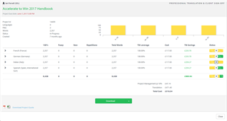
For context, I have included a couple of screenshots to show the current behavior for both the project tile and project details page. There is actually a subtle difference in how the statues are represented. Whilst they are both in yellow, one of the statuses has a darker yellow chevron pattern within the bar.
Regardless, I tend to agree the status could be made a little more clearer through the use of different colors. In the next couple of months, we will be migrating to a new UI theme in ManTra referred to as the "Graphene" project. This is part of our longer term strategy to converge on a standard user interface across all of our language technology products. I therefore suggest we review the way we display status as part of that initiative. I'd be happy to review some of the provisional designs with you and the customer, Josje, once they are available. Let me know if this is something you would be interested in doing.
Cheers,
Ian


 Translate

